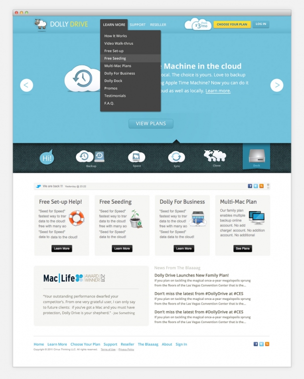
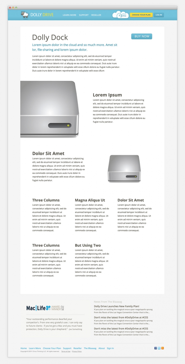
Additionally I assisted, via product structure and naming systems, in helping Dolly Drive simplify their wide range of services and products as well as fine tuning other areas of messaging and information architecture.
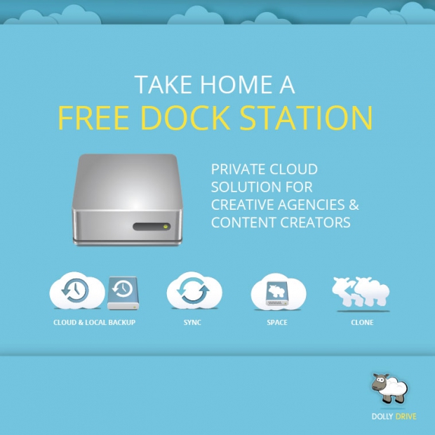
With these more organized services and products came dedicated iconography to further help communicate the range of services Dolly Drive offers not just in marketing material but in the desktop Dolly Drive app itself which received some freshening up as well.
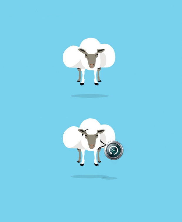
Their existing logo mark had some tweaks applied to it as well as new typography for the text.
![]()
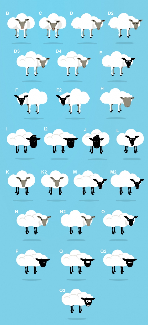
Unused Logo Variations
I took their existing Dolly logo mark, brought the concept of cloud to it and created a whole new, fun look for the gal. The client chose in the end, however, to apply the “cloud-ification” to their existing Dolly rendering. Below you can see some of the unused logo variations.
